B.
DISCIPLINE
UI/UX
COMPLETED
Aug-19
TOOLS
Figma
Adobe Illustrator
Adobe After Effects
DETAILS
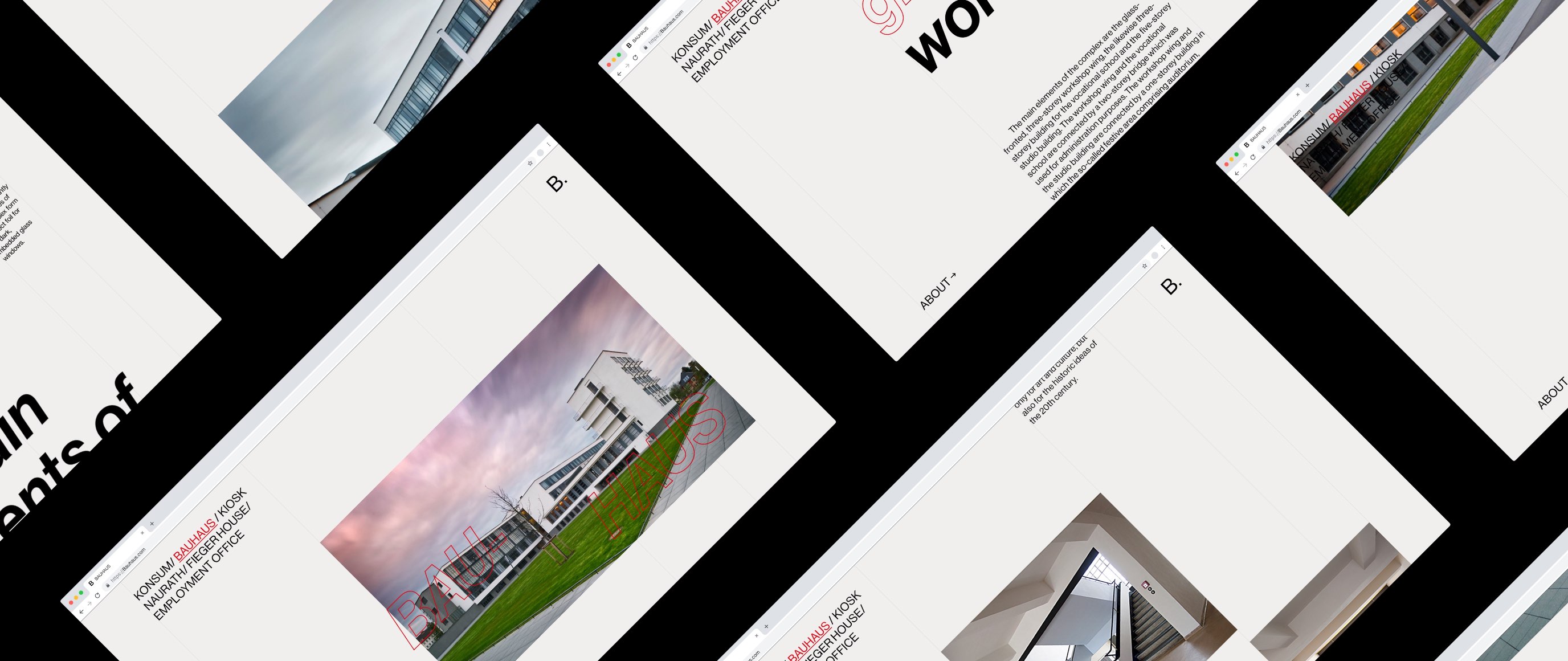
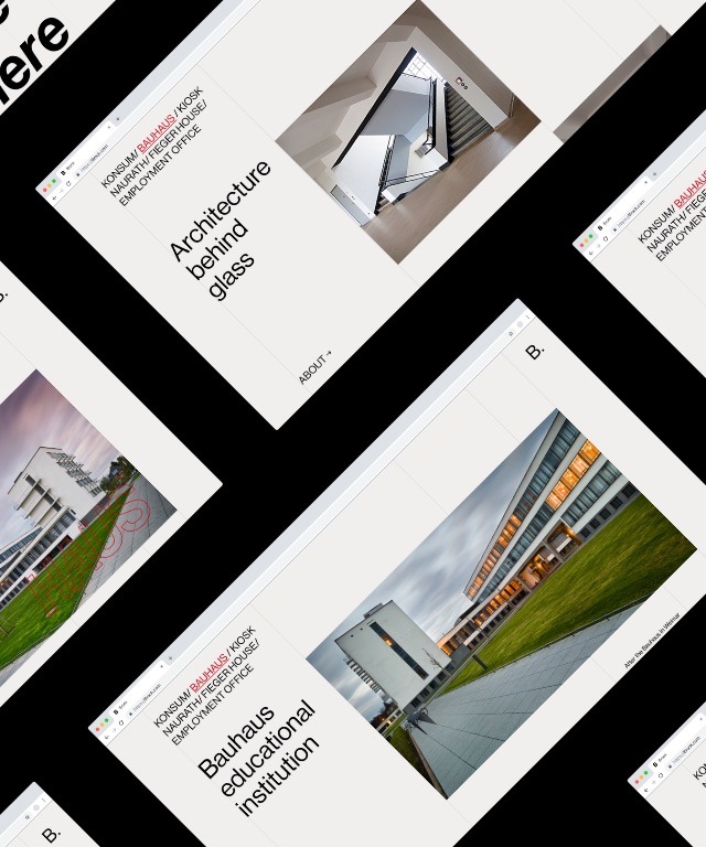
B. is an informational website designed to showcase critical works of the Bauhaus movement. I used a minimalistic approach while structuring the layout. This is a direct reference to the architecture style seen during this period.
CHALLENGE
Develop an easily navigatable informational web page that displays all the most prominent works of the Bauhaus movement. Create an interesting vertical layout that displays imagery and text in an architectural style.
CLIENT
B.
DISCIPLINE
UI/UX
COMPLETED
Aug-19
TOOLS
Figma
Adobe Illustrator
Adobe After Effects
DETAILS
B. is an informational website designed to showcase critical works of the Bauhaus movement. I used a minimalistic approach while structuring the layout. This is a direct reference to the architecture style seen during this period.
CHALLENGE
Develop an easily navigatable informational web page that displays all the most prominent works of the Bauhaus movement. Create an interesting vertical layout that displays imagery and text in an architectural style.
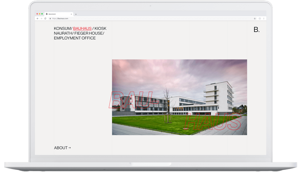


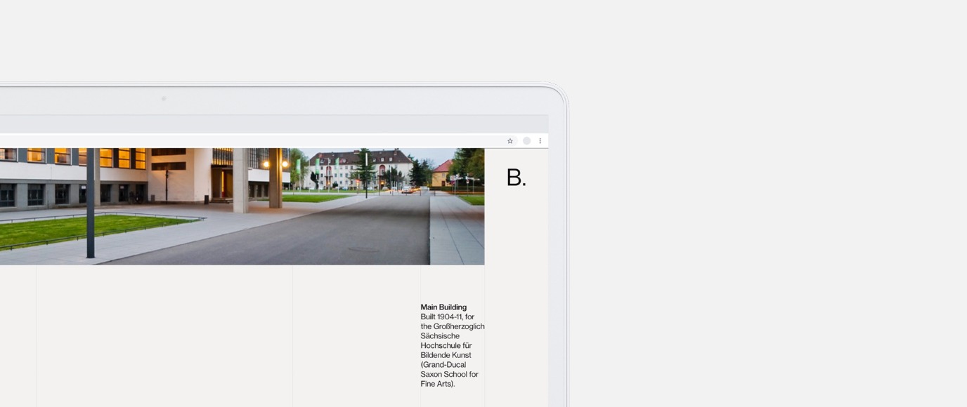

The layout is composed of 6 columns structured after a 12 column grid. The layout ensures the website will read cleanly and with little distraction. Each segment is measured to be the optimal size to fit the content it contains.
The layout is composed of 6 columns structured after a 12 column grid. The layout ensures the website will read cleanly and with little distraction. Each segment is measured to be the optimal size to fit the content it contains.
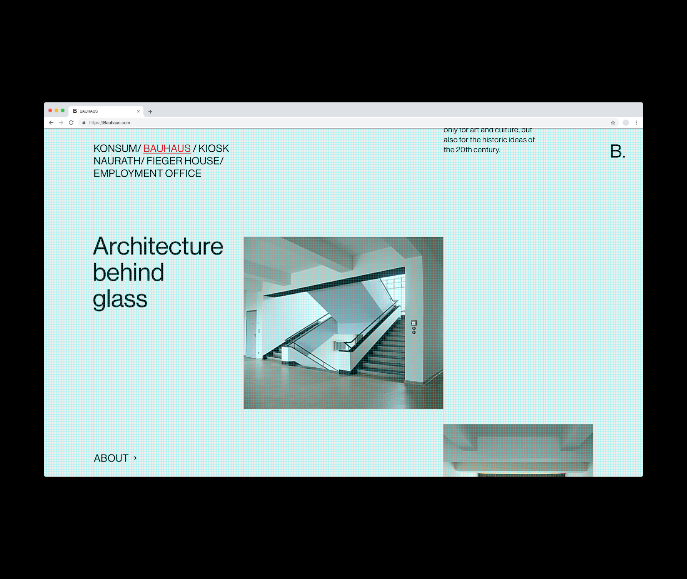


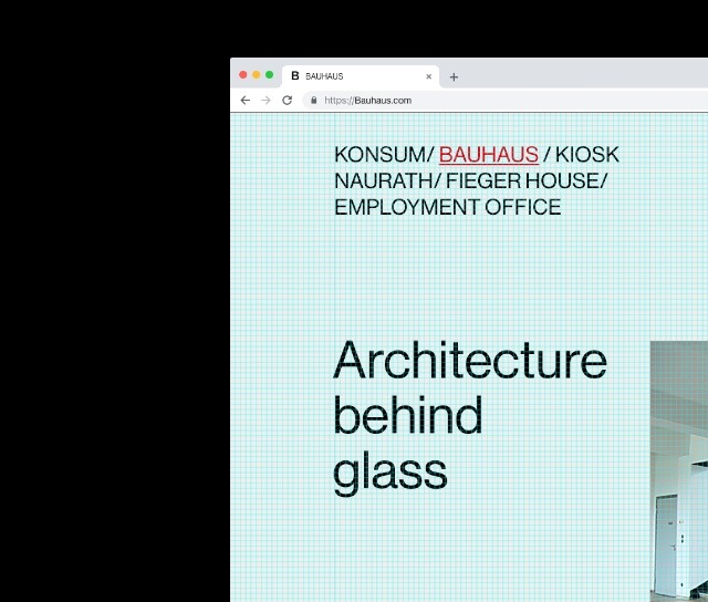


The base unit of the grid used is 8px, which matches the most mainstream display devices. Most resolutions are divisible by 8,16,24,32 and 40 making 8 a very useful number when developing a responsive grid layout.
The base unit of the grid used is 8px, which matches the most mainstream display devices. Most resolutions are divisible by 8,16,24,32 and 40 making 8 a very useful number when developing a responsive grid layout.
